Updating a menu to match more current branding
I typically love graphic design projects such as these, but I must admit that this particular project is one that I’m glad is done. Graphic design is hardest when there are multiple stakeholders with vary different opinions on what they like and what they want included and excluded in a project, especially when those opinions are less about the design and more about the content.
Essentially, I needed to take the old menu which had been in use since around 2014 and bring it into this decade. I had worked with the menu a few times in an attempt to update it’s design in smaller ways by replacing the photos, but by 2023 it had become a goal of the CMH Nutrition Services to fully revamp the inpatient menu and make it a bi-fold to accommodate the new printing machines that the hospital had which could not make a trifold from 11 by 17 paper.
CMH Menu 2022
The old menu, despite not looking terrible once printed, was a mess in the design file. Many of the blue elements in the design were exported photoshop files that had once been Illustrator files which had long since been unlinked so there was no way that I could manipulate them without the necessity of completely remaking them. The images in this design are stock images that I used to replace the older (and uglier) photos of the actual food that Nutrition Services had taken photos of years prior. It was tricky to find a balance between photos of food that looked nice and photos that accurately represented what we offered on the menu. I had worked meticulously to get this 2022 rendition of the 2014 menu faithfully translated into Spanish and it had gone through a number of revisions to the point that I was ready to be done with the menu for good at the beginning of 2023. But a few months into ’23, I was asked to completely redesign the menu.
CMH Menu 2023
A common theme among many of my graphic design work at Columbia Memorial Hospital has been updating our print and web designs to match the branding and colors of our website: columbiamemorial.org. The old colors of CMH where very primary: red, blue, and white. CMH had moved on to a much warmer and more inviting scheme that matched the earth tones of Coastal Oregon. Deep greens, blues, teas, and yellow accents are what we called “website colors” and were the go to hues that I can still spout out the hexadecimal codes to.
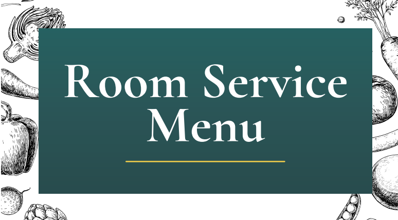
I debated a lot of directions for this menu and everyone under the sun had an idea or example of what they wanted this to look like, but most ideas people had seemed to miss the fact that these menus have a LOT of text and offerings. A graphic heavy menu with pictures of all the food was out of the question for a 4 (3 if you don’t count the cover) page menu. I settled on arranging some stock pencil art of vegetables and clean green gradients for the menu.


