Pushing the designs in fun ways
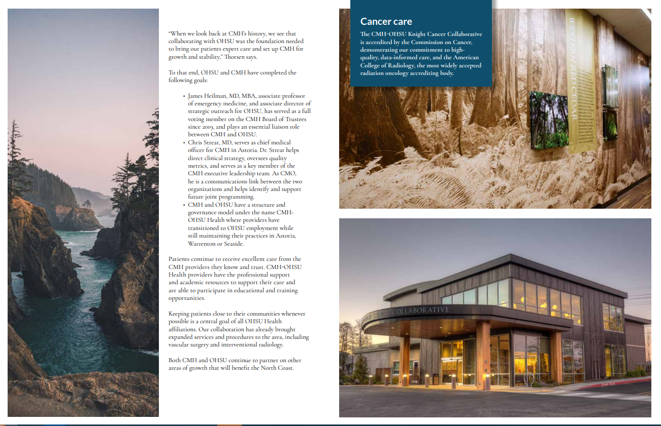
Working with one brand for a long time is both a blessing and a curse. The blessing is that when you get familiar with a brand, designing things for it can become easy; you use the same fonts, colors, and even stock images. The Curse is that you are stuck with the same fonts, colors and stock images. Finding new ways to design things that will both differentiate the design from it’s siblings while also still conforming to the family that is the brand become a bit of a challenge over time. With this design, I spruced things up with a new stock photo of Haystack rock at sunrise that really caught my eye. We often recycle similar stock photos again and again for different projects, so a new image can really inject a feeling of newness to the lineup. I also tried a few new things with that photo like using it as the frames for the provider portraits on the back of this flyer. That was an effect that I knew I wanted to do, but took a bit of relearning to achieve. I was pretty happy with the result.


