Getting comfortable with clean simple design
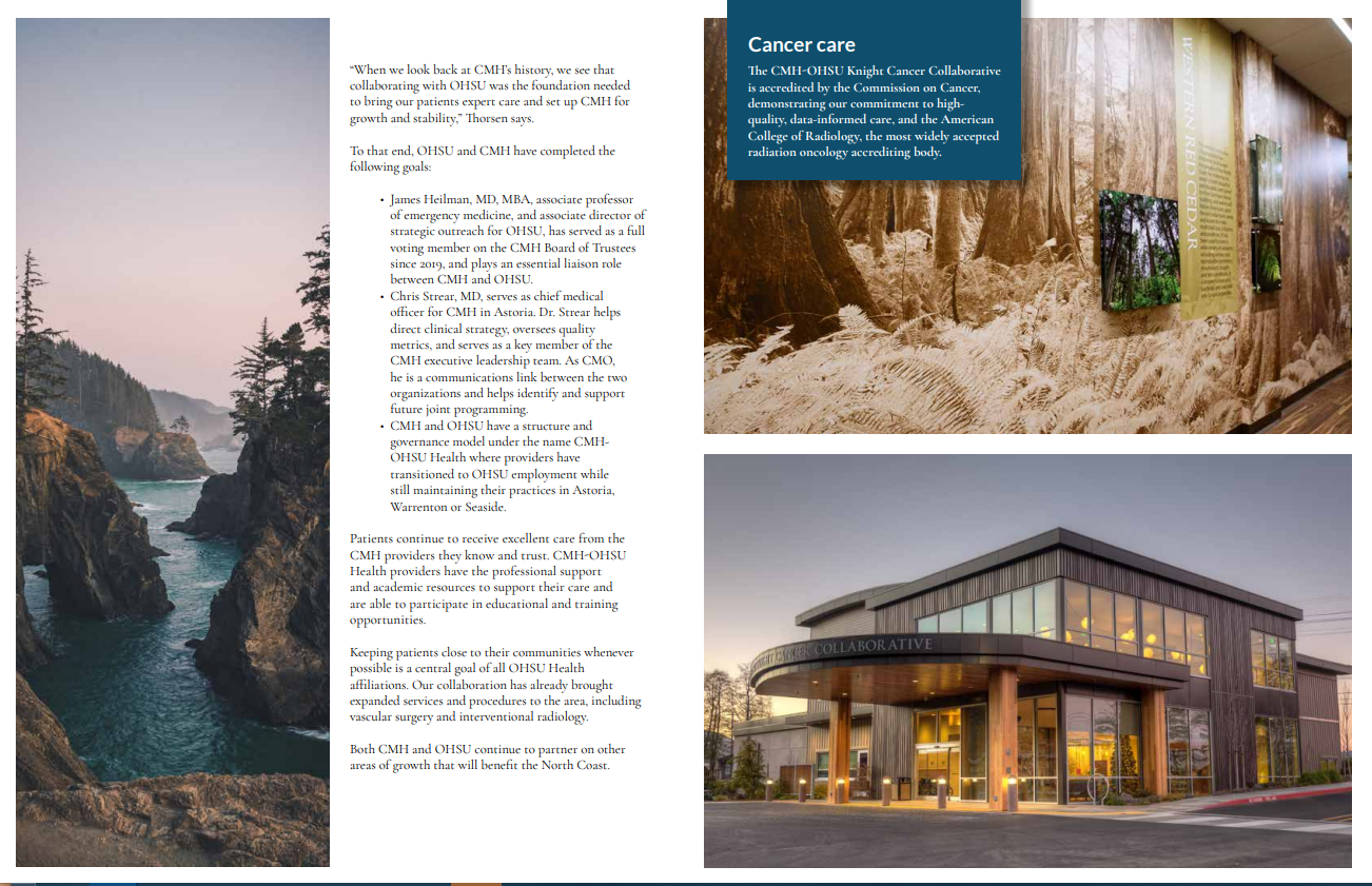
I am quite pleased with how simple this design ended up being. This was a very text heavy trifold which can be difficult to work with while maintaining a slick design. I usually advocate that “less is more” for text and copyright, but oftentimes I am asked to simply make due and make things look as nice as possible. I settled with a simple design that would be accented by photos that felt warm and embracing, while still in an understanding and fitting tone that matches the somber subject matter. It can be a tightrope walk to make someone feel more warm and content when discussing difficult things such as hospice, so my choice in photographs was key.


